The personal, professional approach to bespoke design
ABOUT ME
Welcome to BigMan Designs. I'm a one man show whose aim is to help you bring your ideas to life.
I've been designing both for digital and print for over 12 years now and have managed to work with clients both well known and local. I've worked on single fliers through to complete e-commerce solutions, from brand guidelines through to wedding invitations.
I've always been interested in art and graphic design. My university years being hidden away in a dark room practising the art of animation and upon graduation picking up the skills of web design and graphic design.
More recently I've been in charge of a team of graphic designers and been the lead designer for a company developing bespoke number plates.
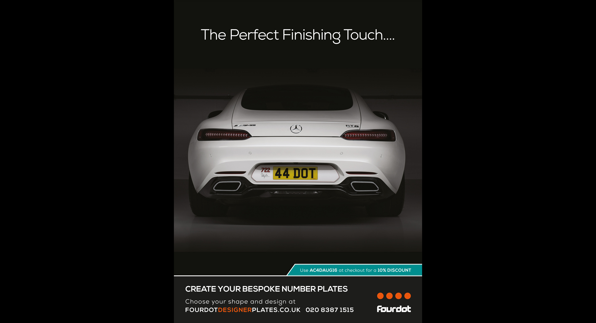
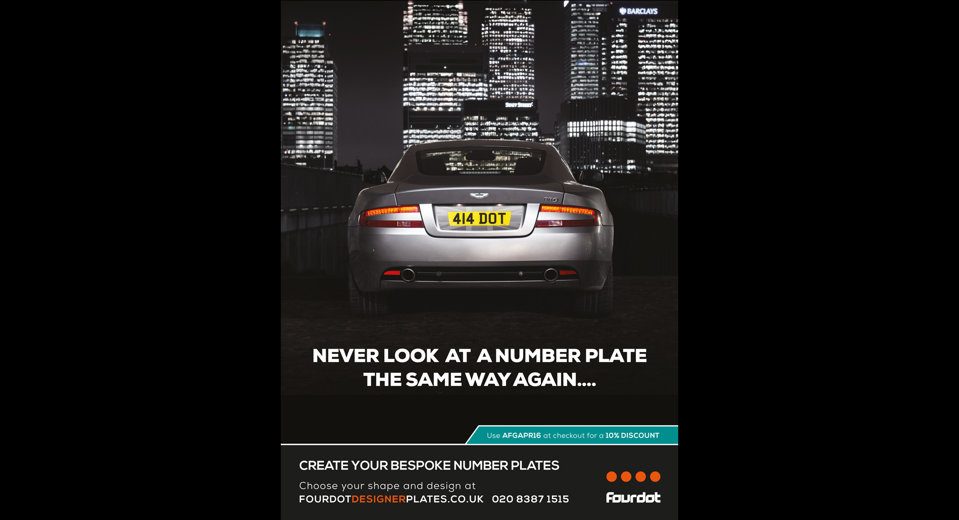
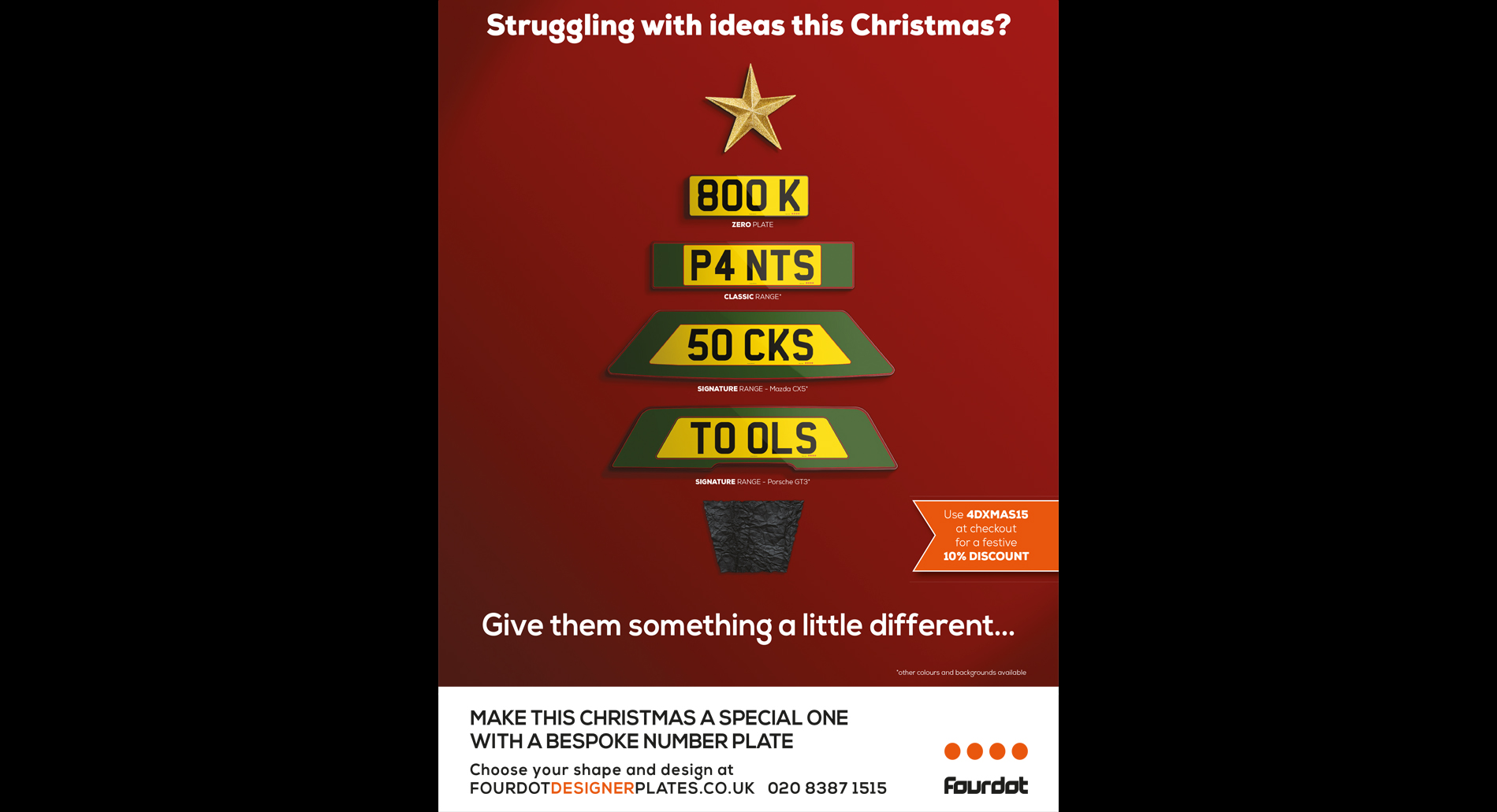
FOURDOT DESIGNER NUMBER PLATES
WEB DESIGN / WEB DEVELOPMENT / UX / GRAPHIC DESIGN
I was brought into the company to head up their digital department. They had literally no online presence and needed help not only in creating a website but also developing the complex configurator needed for their product.
Over the past few years we have developed, from scratch, an incredibly complicated online number plate configuration tool. This not only needed to be easy to use front end but had to be completely automated back end and be able to produce complex, print ready files for our factory once the customer had purchased the plate.
I've been involved in every step of the development process from concept through to design and build for the main website, the configurator and all website content. We've created a bespoke backend admin area for file and asset management, number plate creation, image processing and much more.
For each individual plate shape there needed to be multiple files uploaded, enabling the front end to create the preview of the choices made. We needed a library of graphics to put on the plates which needed to be in varying sizes to match the plate specification. As an extra touch we added car images for each choice, which had to be web ready and coloured to match the paint shades. We also had to tailor an opensource checkout system to work with the plate configuration.
The website is fully responsive down to mobile phones, the plate creator is responsive down to tablet, with a mobile version being developed.
We have built up our social media presence and implemented Google marketing alongside Analytics to enable us to improve user experience and reach more potential customers.
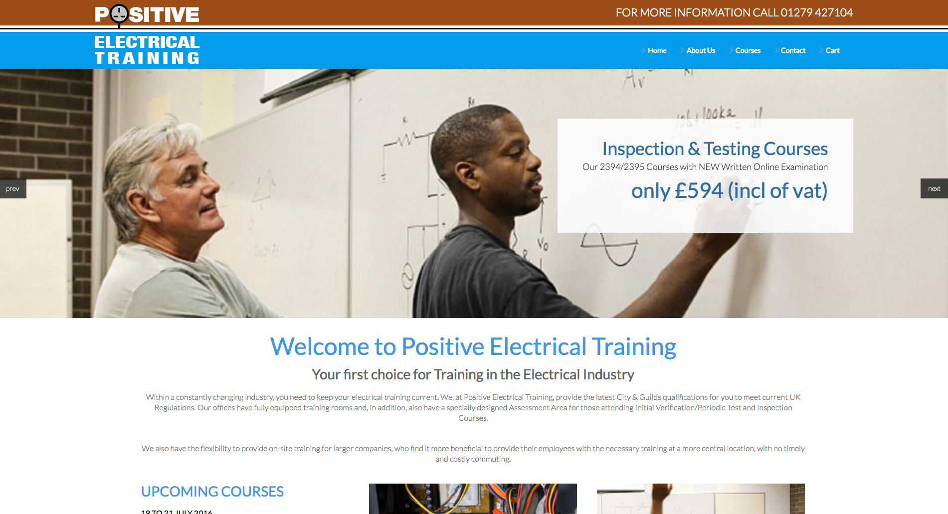
This company wanted a new online presence to sell their courses. Having created a simple one page site they now wanted to create a full scale online store. The design had to be simple, clean but attractive. They wanted a few moving pictures but most of all it had to be simple to use.
My first step was to see what other sites were out there and look at ways of implementing the booking system. The client wanted something completely bespoke so the site was built from scratch rather than using Wordpress or a pre-built template
At the time I was using a CMS system called Perch. It is a relatively small CMS but what I liked about it was the ability to integrate it into my HTML rather than the other way round. Unfortunately the shop plugin they used wasn't advanced enough to allow for virtual products such as courses. The client needed something more advanced which could assign dates to courses and they could also update the course with various future dates
I incorporated the company colours and a carousel on the homepage so they can show people what they do. The whole site is CMS based, including the shop section, so they can add products and information as they get them. The site is also linked to payment gateways through the store so they accept credit card payments.
The big challenge on this site was making the shop work for courses as it was only set up for products. This was overcome by adding some custom code to enable extra options for products.
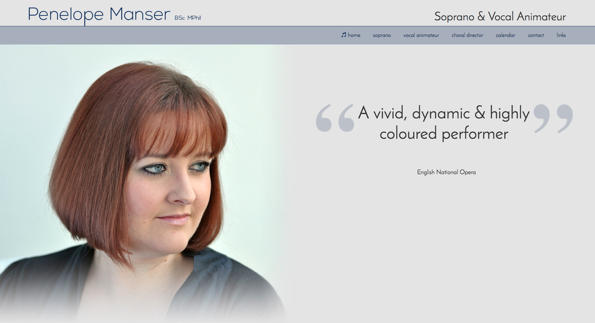
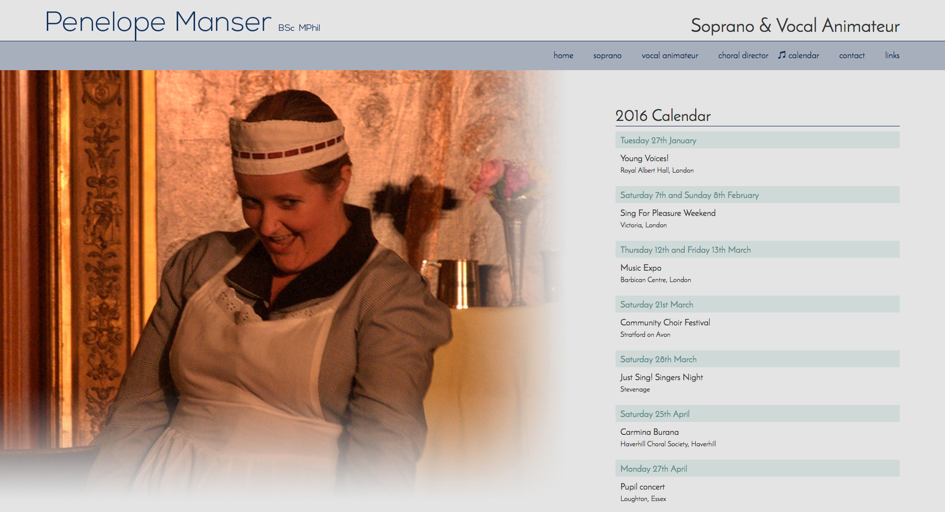
Penelope had a very basic online presence using a dated template system. She wanted to update the site to be responsive as more and more of her customers/clients were mobile based and couldn't see the information they needed.
Penelope wanted the site to be very image heavy, with a nice photoshoot having just shot to give her some good portraits, alongside various photographs from her performances.
Another requirement was that she wanted to be able to update it herself so it needed to have a CMS. Again I integrated Perch as the admin area is incredibly user friendly. Once this was added she had control over quotes, content and calendar, meaning her site could always be up to date.
I went for a nice pastel palette with fades adding to the artistic feeling. Content was kept to a minimum and compliments the imagery.
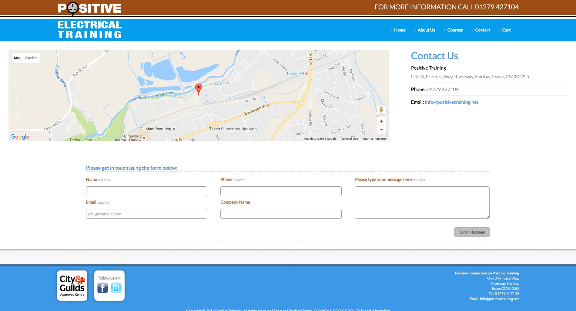
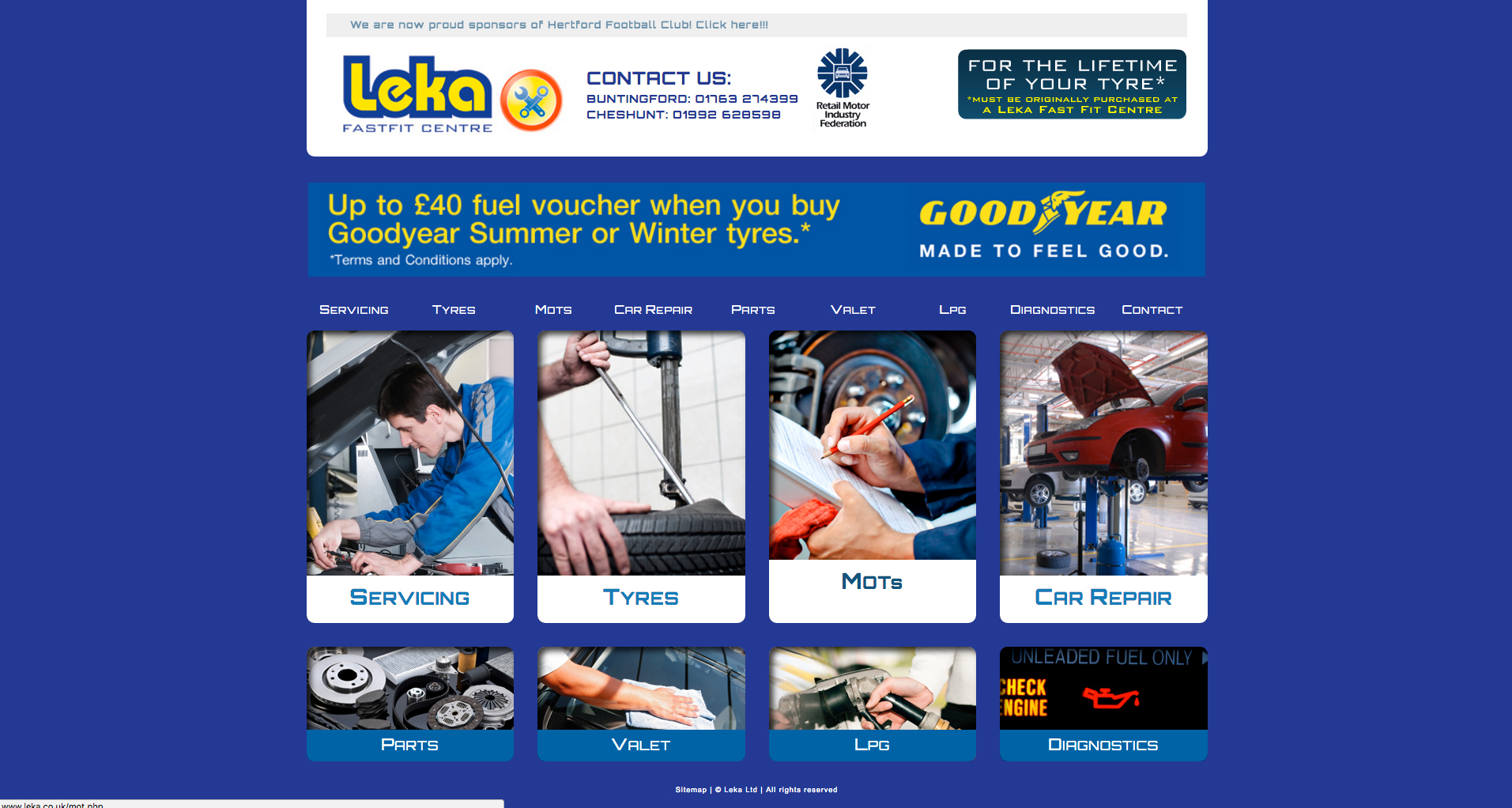
This client was suffering from free template/website syndrome and had four sites, created via multiple free systems which were all branded differently, had different URLs obviously and also had different company names.
The idea was to merge all the information from the different sites into one branded website
I created a simple, image based navigation so that it was immediately clear where to go on the site. A clean little hover animation gives the site a feel of interactiveness and a simple booking form is also included for MOTs and Services.
Each page had unique imagery but a uniform feel, so previous, and new, customers knew they were on the same site.
The brief was to produce an information leaflet for this serviced office block. I was given plenty of photos and copy and delivered a few different designs using their website and current literature as a base. This was the chosen design which I am using as the base for future leaflets.
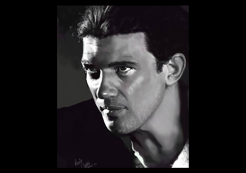
As well as keeping up with traditional media I also like to draw and paint digitally, when time allows. I have always loved drawing portraits and used this to help finance my way through university, selling drawings in a shop in Cardiff.
Vector illustrations composed in Illustrator and printed onto canvas.
To stop myself from getting rusty I enroll in life drawing classes. These classes usually consist of a number of 15 minute drawings/paintings of various poses, models and materials. It helps me keep my artistic eye in.
Adobe Creative CloudGoogle Sketchup3rd Party Render Engine
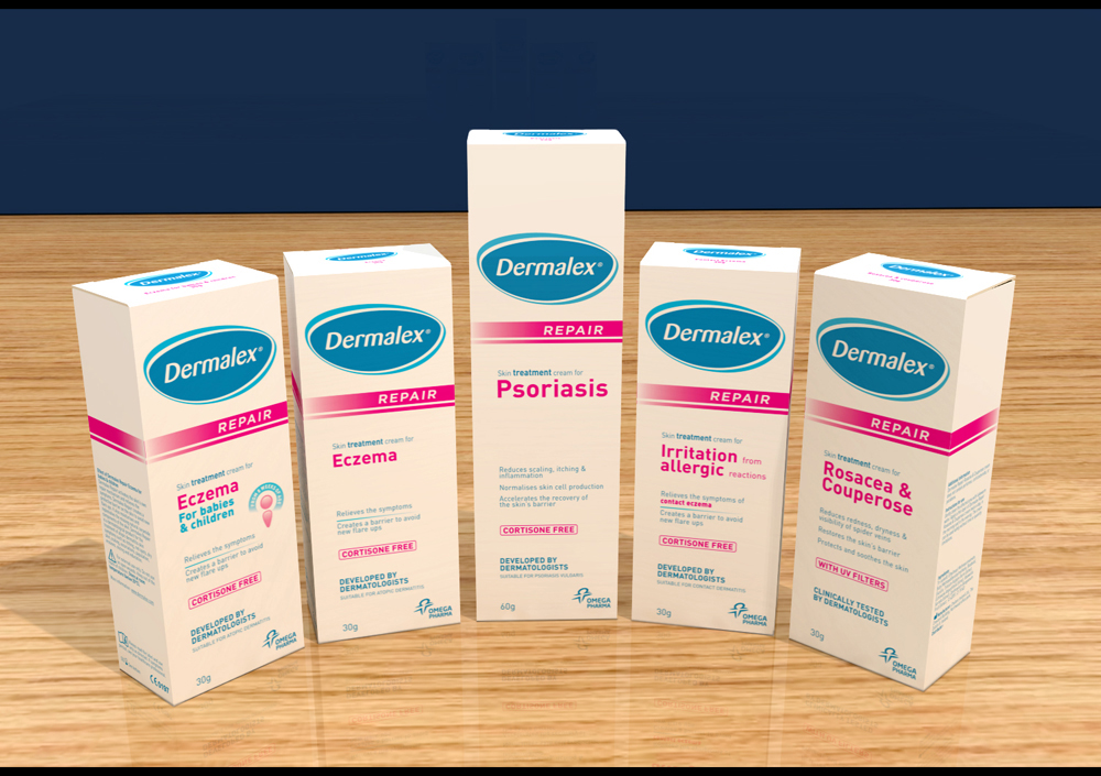
We were supplied with the Dermalex flat artwork and asked to create some promotional shots. I created this shot in Sketchup and rendered it through an external renderer so this could be used for publicity shots for the products and on POS.
This is another 3D visual for a plinth to be designed to go nationwide in stores. We were given a scamp to work from, and a list of products and told it had to reflect the pack designs. This is the design we came up with within the size constraints of the shelf. This is another 3D mockup of a shelf edger. Using the 3D program means we can work out the exact size of the shelf edger and create the artwork as see exactly how it will look without creating an actual mockup. We were give the line-up of products and then designed the front panel to reflect the designs emphasising the “Insect Repellent Factor” for each product.
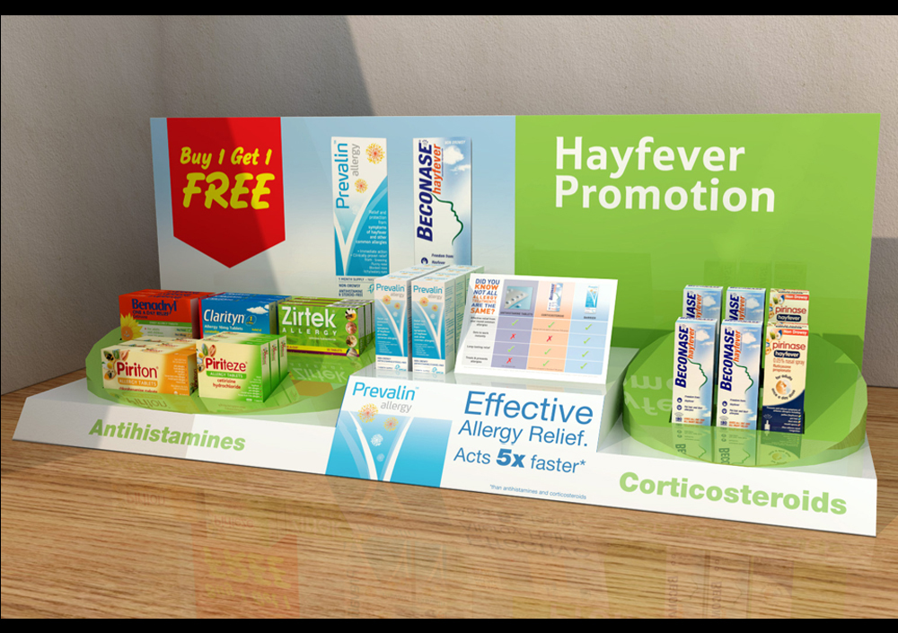
This was created as a test to try a new shelf tray layout. We needed to emphasise the different types of hayfever medicines and so grouped them with the main product raised to give it a bit more gravitas.
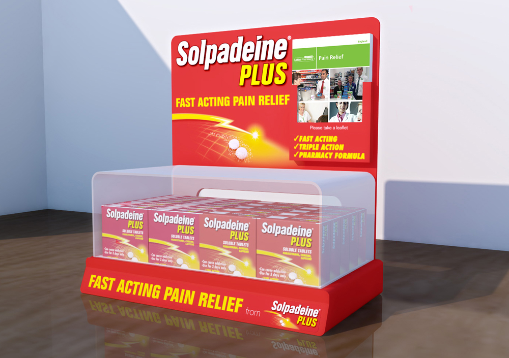
This was a visual for a counter tray to be used in pharmacies nationwide. The unit had to be encased in perspex to prevent the customer from taking the product. There is a cutout at the back so the pharmacist can reach the product and re-stock. Designed around the pack design with the product slogan.
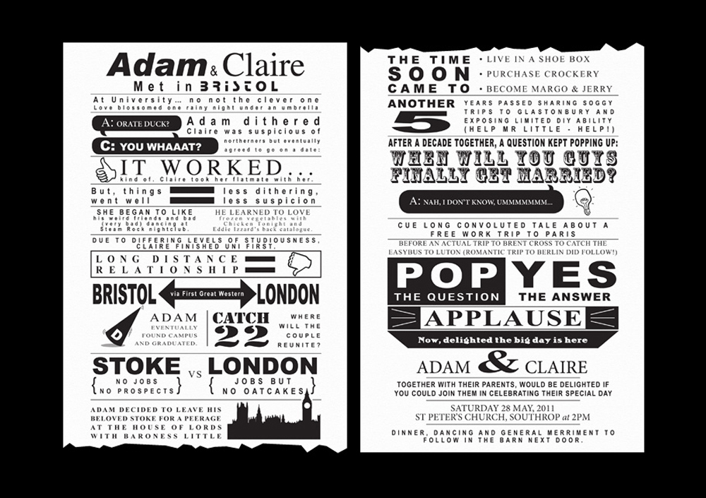
The client had an idea in mind for this stationary set and had sent images of what they liked. When the text was provided I then laid it out as a long story using different fonts, illustrations and symbols to read like an old fashioned illustration. The client liked the idea of a hand drawn map so with a little help from Google Maps and some images of the venue and church I created a hand drawn, illustrated map. To complete the set I added an Order of Service and Reply Card.
This wedding was based around a music festival theme. The couple already had an illustration drawn by a family member but wanted their invitations to look like a festival ticket. Having been given the information to put on it (quite a lot) I then had to squeeze it all on in the style of terms and conditions and ticket information. A really fun project.
I was asked to create some custom wedding invites for a client. The brief was quite open, although they did have a rough idea of what they were after. Having read the brief and knowing that they like a bit of travel I decided to design the invites around a passport.
The information was laid out in the style of the photo page of the passport to include venue, times etc and the blank page contained relevant information. Three styles were printed for the different parts of the wedding.
Along with the Passport wedding invitation I was asked to help create their table plan. The idea was a map with all the destinations pinned on it for each year of their relationship. A table for each year. The people on the table were then the address of the postcard and a special message about that year as the postcard content.
I was commissioned to illustrate 2 images and layout this couples wedding stationary. Both images were to reflect their personality and include the car they were currently restoring. I also added little bits to each illustration specific to them such as subtle nicknames and pets.